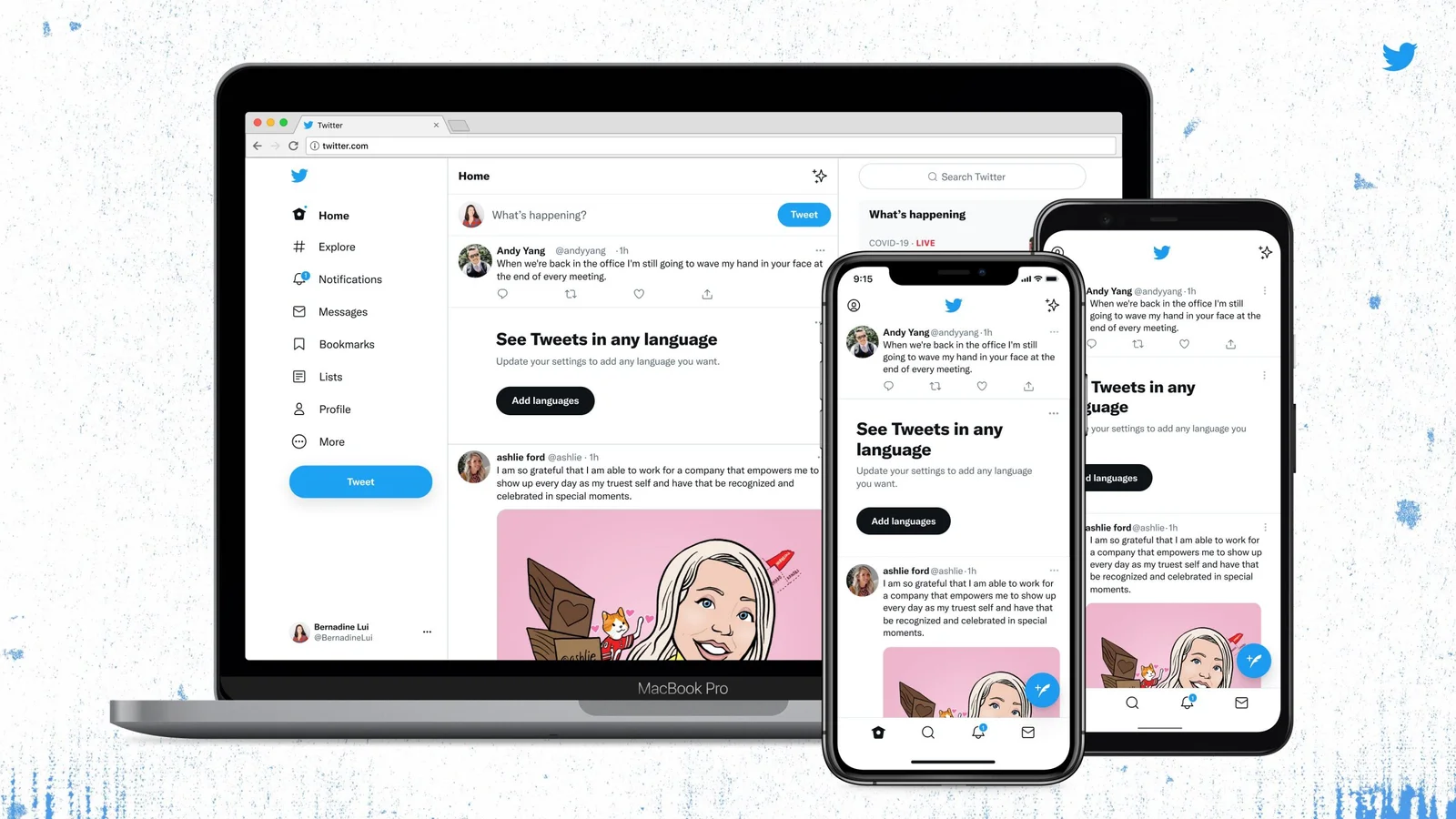
Twitter is changing the contrast on its buttons as a result of feedback from earlier this week’s design revisions. Eye strain, headaches, and migraines have been observed owing to the greater visual contrast in the buttons and links, as well as the new typeface, Chirp.
People who are used to it being the other way around have been confused by the new follow button, which is black if you’re not following someone. No one knows yet if the change will be overturned.
Immediately following Twitter’s redesign, there were conflicting reactions. Over time, some Twitter users have probably become accustomed to the change. The new design, however, has highlighted a frequent problem in online accessibility: a lack of options, according to many who have complained.
If users had more granular options and could choose the degree of contrast that fits them, rather than waiting on Twitter to make global changes, it might save a lot of difficulties. In the meanwhile, Twitter’s @TwitterA11y account is collecting input on the modifications.


